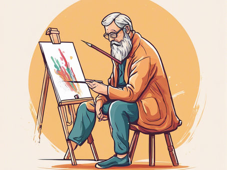
During the past couple of weeks, we faced the 'logo problem' at nonbios. For those new to the debate, the issue was well summarized in a...
During the past couple of weeks, we faced the 'logo problem' at nonbios. For those new to the debate, the issue was well summarized in a recent TechCrunch article (https://lnkd.in/gPveRPR4). Put simply, how do you visually represent something that has no inherent appearance? AI can perform countless tasks but lacks a tangible form, yet it needs a visual identity in user interfaces.
To address this, many companies have gravitated toward abstract shapes and non-threatening visuals. The most familiar AI logo, that of industry leader OpenAI, is a "stylized hexagon." Meta uses a blue ring, Google Gemini a blue star, and Microsoft's Copilot logo is an abstract design that defies easy description. The overall trend leans towards simplicity and non-human appearances, steering clear of anthropomorphic representations.
At nonbios, we chose to take a departure from this trend. We are building an AI deeply inspired by how the brain works. Our hypothesis is that such an AI will exhibit sentience - a defining attribute of the human brain. While we don't know if it will end up exactly like the brain or evolve into something completely different, we expect it to retain some semblance of human cognition.
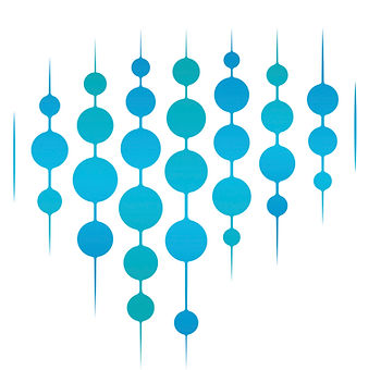
Our logo reflects this unique approach with a design that embodies our vision of AI that is familiar yet distinct from biological intelligence. The choice of blue represents trust. When you deploy the nonbios AI to work for you, you should be able to trust it to do the right thing. We hope to build this trust not only in our systems but also with our customers.
We'd love to hear your thoughts in the comments below.


.webp)
